Chart.js で縦向きと横向きの棒グラフを作るサンプルや基本的なプロパティの解説。
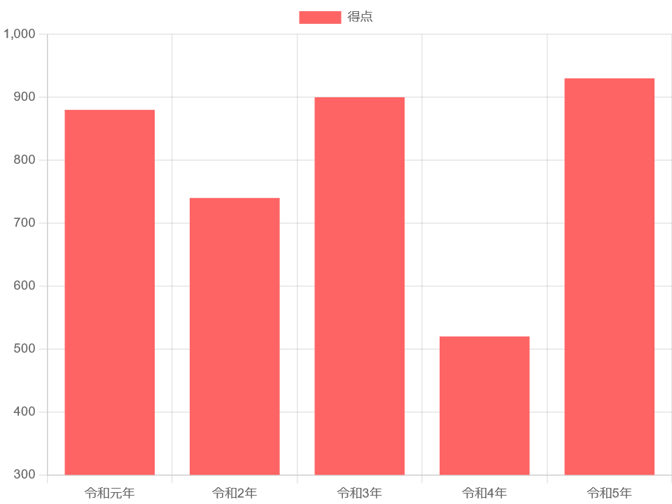
まず、Chart.js で簡単な縦向き(垂直)の棒グラフを作る。 ここではChart.js Ver.3系(以下v3)を使う。 コードは以下の通り。
<script src="https://cdnjs.cloudflare.com/ajax/libs/Chart.js/3.9.1/Chart.min.js"></script>
<style>
#ex_chart {max-width:640px;max-height:480px;}
</style>
<canvas id="ex_chart"></canvas>
<script>
var ctx = document.getElementById('ex_chart');
var data = {
labels: ["令和元年", "令和2年", "令和3年", "令和4年", "令和5年"],
datasets: [{
label: '得点',
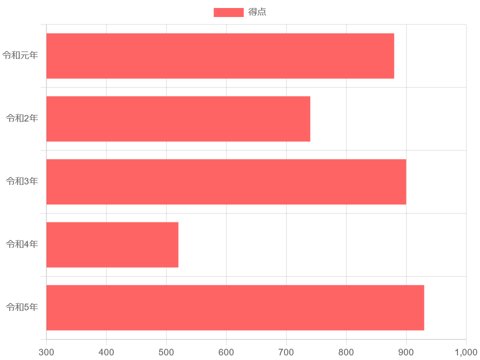
data: [880, 740, 900, 520, 930],
backgroundColor: 'rgba(255, 100, 100, 1)'
}]
};
var options = {
scales: {
y:{
min: 300
//beginAtZero: true
}
}
};
var ex_chart = new Chart(ctx, {
type: 'bar',
data: data,
options: options
});
</script>
backgroundColor で棒の中に色を塗れる。 borderColor と borderWidth を使うと棒の周囲に線を描けるが、ここでは書いていない。
options にある min は y(y軸)の最低値を指定している。 beginAtZero はここではコメントアウトしているが、minの代わりに指定すると0(ゼロ)スタートになる。
赤字の部分は、後述のサンプルで変更を加えていく箇所。
以下、表示例。
なお、x軸、y軸のオプション指定方法がv3から変更になっている。 v2では以下のように記述していた。
var options = {
    scales: {
        yAxes: [{
            ticks: {
                min: 300
            }
        }]
    }
};
v2の記法のままだと設定が反映されなかったり、後述するラベルが表示されない等の不具合が生じる。
横向き(水平)の棒グラフは、v2では type に horizontalBar を指定することになっていたが、v3で変更になった。 v2からv3にそのまま移行するとエラーになりグラフが表示されない。
v3では type は bar のままとし、オプションに indexAxis: 'y' を指定する。
グラフの最低値はx軸に適用したいので scales:x に変更した。 基本的なコードは縦向きと同じなので、変更箇所だけ以下に記す。
var options = {
    indexAxis: 'y',
    scales: {
        x:{
            min: 300
        }
    }
};

var ex_chart = new Chart(ctx, {
    type: 'bar',
    data: data,
    options: options
});
以下、表示例。
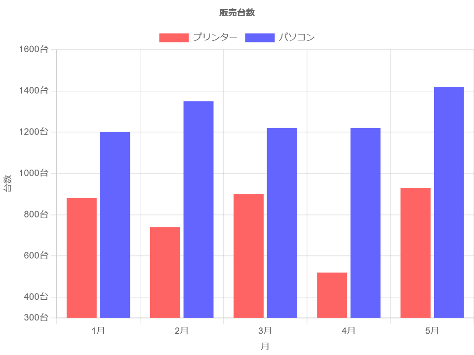
様々なプロパティを指定すると、グラフにタイトルやラベルを追加したり、複数の棒を並べることができる。
各種プロパティの詳しい説明は 折れ線グラフ を参照。 コードは上記サンプルと異なる部分だけ記す。
var data = {
    labels: ["1月", "2月", "3月", "4月", "5月"],
    datasets: [{
        label: 'プリンター',
        data: [880, 740, 900, 520, 930],
        backgroundColor: 'rgba(255, 100, 100, 1)'
    },
    {
        label: 'パソコン',
        data: [1200, 1350, 1220, 1220, 1420],
        backgroundColor: 'rgba(100, 100, 255, 1)'
    }]
};

var options = {
    scales: {
        x:{
            display: true,
            title:{
                display: true,
                text: '月'
            }
        },
        y:{
            display: true,
            min: 300,
            title:{
                display: true,
                text: '台数'
            },
            ticks: {
                callback: function(value, index, ticks) {
                    return value + '台';
                }
            }
        },
    },
    plugins: {
        title: {
            display: true,
            text: '販売台数'
        }
    }
};
以下、表示例。
これで Chart.js を使って基本的な棒グラフが描けるだろう。